Disney+ Mena Logo Arabization
Client: Disney + MENA
Location: Dubai, UAE
Software used: Adobe Illustrator, Adobe Photoshop
Task: to create an Arabic version of the Disney+
logo that maintains the recognizable brand identity while
thoughtfully incorporating elements of Arabic calligraphy and to
resonate with the Middle East audience.
In an effort to cater to the diverse cultural landscape of the
Middle East and North Africa (MENA) region, Disney+ undertook a
strategic rebranding initiative to localize its iconic logo. The
objective was to create a visually appealing and culturally resonant
version of the logo that would resonate with the Arabic-speaking
audience, fostering a sense of familiarity and inclusivity..
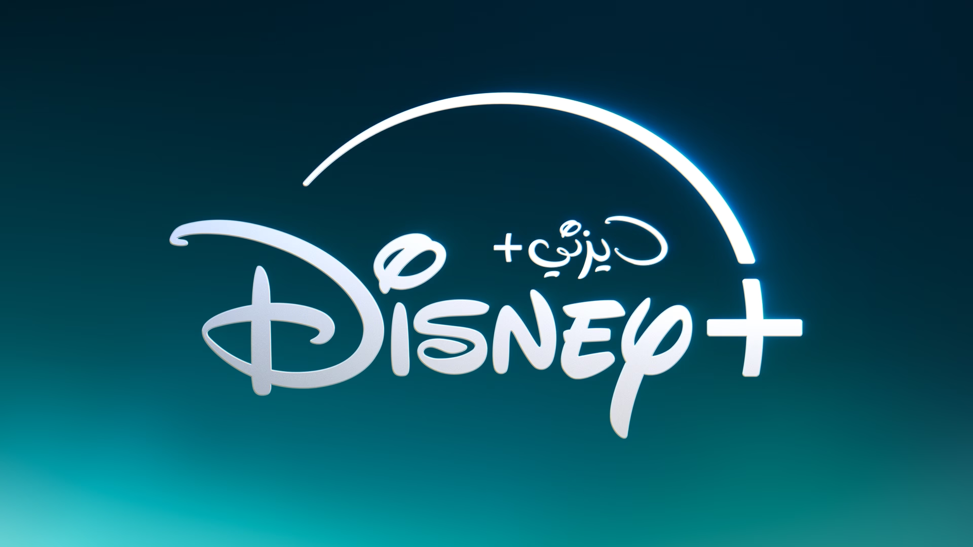
The Arabic wordmark in the new Disney+ logo was carefully crafted to
maintain a visual connection and harmony with the original English
logo. I aimed to strike a delicate balance between honoring the Arabic
calligraphic tradition and preserving the recognizable essence of the
Disney brand identity.
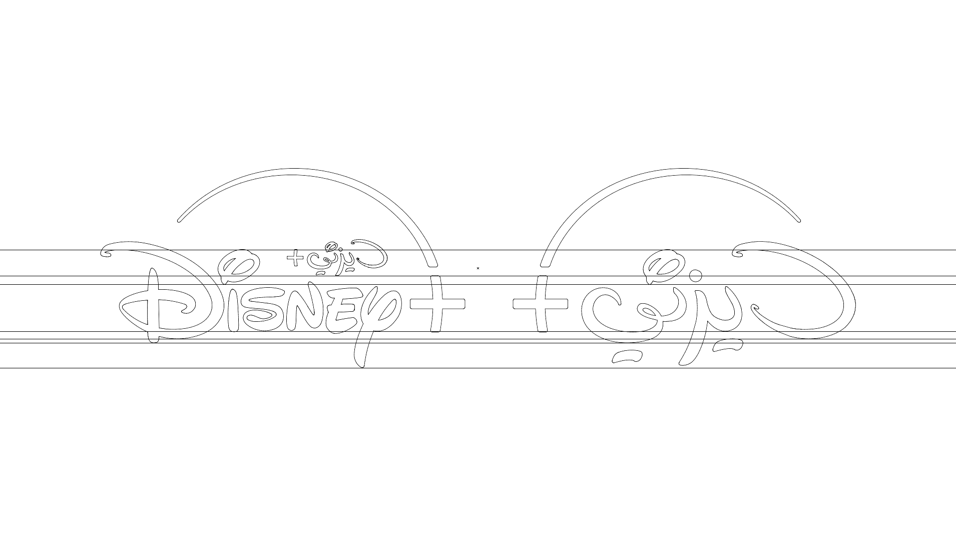
Each Arabic letter was thoughtfully designed to capture the spirit and
distinctive shapes of the English logo. For instance, the Arabic
letter "د" (dal) was stylized to echo the curved stem of the English
"D," while the letters "يز" (ya, zain) mirrored the shape of the
English "Y" This approach ensured that the overall visual rhythm and
flow of the Arabic wordmark remained consistent with the English
version, fostering a sense of familiarity and brand recognition.
By seamlessly blending the recognizable Disney brand elements with the
rich heritage of Arabic calligraphy, the redesigned logo achieved a
unique and culturally relevant visual identity. This approach not only
honored the local aesthetic traditions but also fostered a sense of
familiarity and connection with the Disney brand among Arabic-speaking
audiences.