Disney+ MENA Logo Arabization
Disney+ Middle East and North Africa
Location: Dubai, UAE
Task: To create an Arabic version of the Disney+
logo that keeps the brand recognizable while incorporating Arabic
calligraphy for the Middle East audience
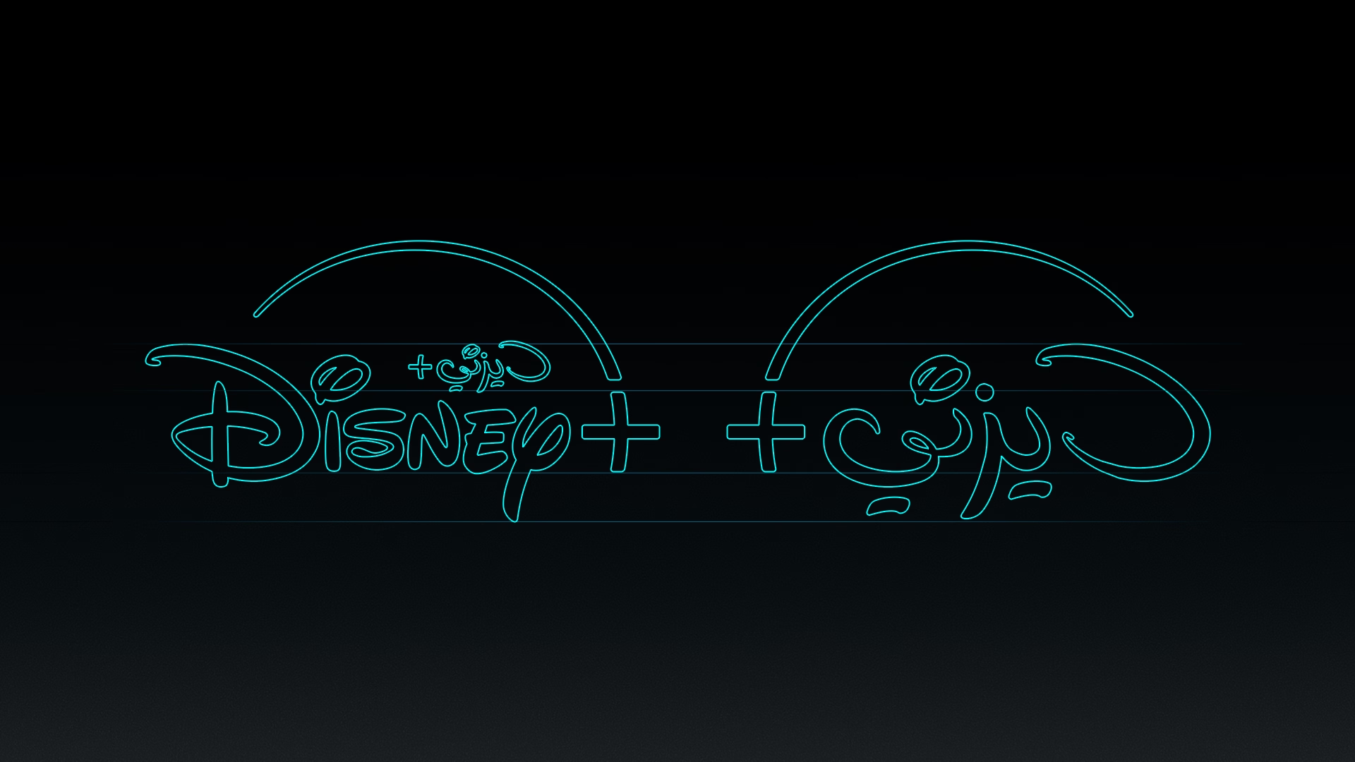
As part of its expansion into the Middle East and North Africa (MENA) region, Disney+ needed a localized version of its logo. The goal was to design an Arabic wordmark that feels natural to Arabic-speaking audiences while staying true to the Disney brand.
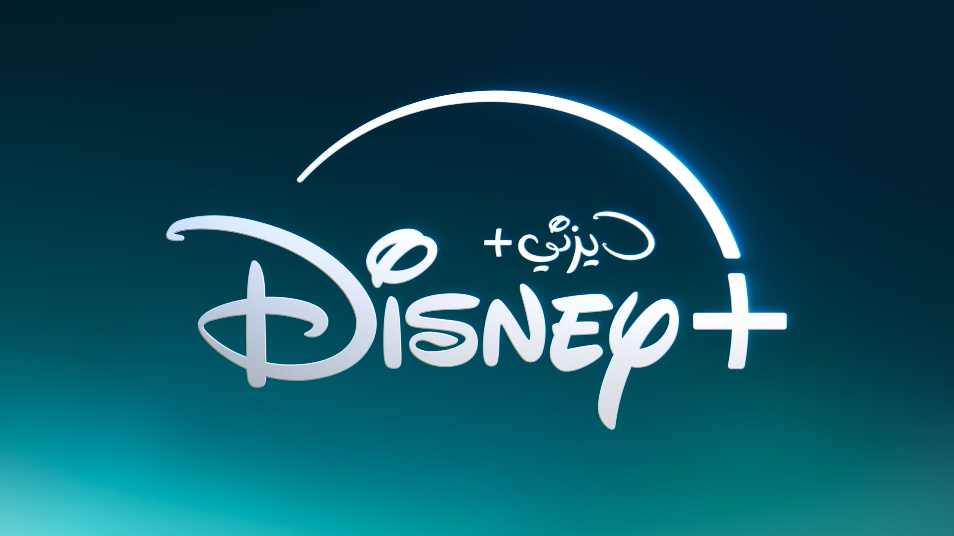
The Arabic wordmark was designed to sit comfortably alongside the
original English logo. The challenge was balancing Arabic
letterforms with the distinctive Disney style.
Each letter references its English counterpart — the Arabic "د"
(dal) echoes the curved stem of the "D," and "يز" (ya, zain) mirrors
the shape of the "Y." This keeps the visual rhythm consistent across
both versions and helps with brand recognition.
The result is a logo that brings together Disney's identity with
Arabic typographic traditions, giving Arabic-speaking audiences a
version of the brand that feels both familiar and authentic.
In the Wild
